XY Charts can generate a chart of column type against the results of a report (e.g., Analytical Results II report) with a date type column (e.g., SAMPLE_DATE of ARII report) being as the X-axis. It calculates the results first, and then plots the calculated statistics, which are explained in the Springfield facility example below.
1.Run the ARII report with Acetone, Antimony, and Benzene (or other analytes) at the B-30 and B-31 locations and start XY Chart.
2.Select Group Series By = CHEMICAL_NAME, Group Charts By = LOC_NAME, Add Series As = Column. Click Add Series to create charts.
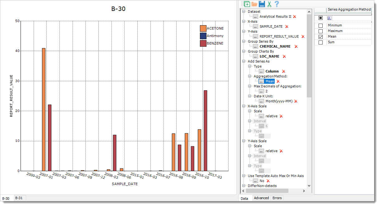
Notes: •By default, Add Series As > AggregationMethod = Mean and Date-X Unit = Month(yyyy-MM). During plotting of the above example, XY Charts converts SAMPLE_DATE of X-axis from the M/d/yyyy hh:mm:ss of datetime format to yyyy-MM, calculates the averages of Y-axis values corresponding to each of X-axis yyyy-MM values, and plots the averages against the yyyy-MM values at the last. •The integer value of the Add Series As > Max Decimals of Aggregation: Parameter is used to round the calculated Y-axis values of the Column Chart. •When Date-X Unit is selected as other than Default, the X-axis data are of text type or the X-axis is of category type. When Date-X Unit is selected as Default, the X-axis data are of datetime type. •If X-axis labels overlap each other, their angles can be adjusted by selecting the Advanced Tab, then clicking on the X-axis area and selecting LabelRotate = True and LabelRotateAngle = 45 in the Advanced Tab. Currently, auto-adjustment to overlapped X-axis labels (HidePartialLabels =True and LabelIntersectAction = Rotate in the Advanced Tab after selecting the X-axis) are coded into building Column Chart. |